A category-challenger brand design and identity, built to scale without losing its roots

The challenge

d.OAT as a brand had traction. Their hero product d.OAT Oat MLK was landing, but the brand wasn’t carrying its weight, or allowing them to scale.

This wasn’t another plant-based startup chasing trends either. The Dublin-based founders, a barista and a chef, were true makers who came from behind the café bar – people who care about taste, texture and performance in the cup. Their ambition was clear: raise the bar and set a new standard for how alternative mlks show up in coffee and baking.

However:

  • The brand name limited future expansion
  • The brand design lacked consistency and authority
  • And the bigger ambition – to lead, not follow, wasn’t yet fully expressed.

They didn’t want to lean on wellness tropes or sustainability theatre either. They wanted something sharper. More honest and built on craft and incredible taste, not claims.

They needed a Dublin branding agency that could scale with them, and stand up in any café, anywhere.
 

The solution

We didn’t ‘tweak’. We cleared the table and reset. That’s what they wanted from their branding agency. That’s what they got!

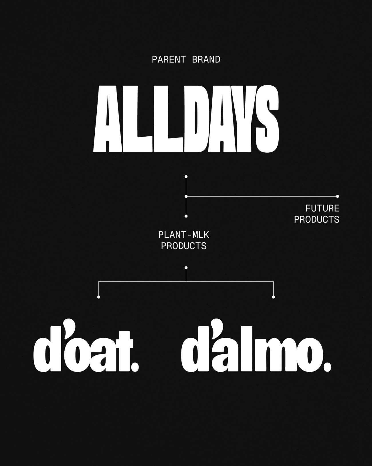
Then created ALLDAYS – a master, parent brand built for longevity, flexibility and everyday relevance. A straightforward, unpretentious name rooted in café culture, and products that work for all days, for all makers.

From there, we built a clear, scalable brand architecture:
ALLDAYS at the top, with product lines d’oat. and d’almo. sitting confidently beneath it, now with scope to scale beyond those two products for the future too.

We also refined the product naming to bring clarity and character in equal measure – simple, distinct names with a subtle nod to the brand’s Dublin roots and personality baked in.

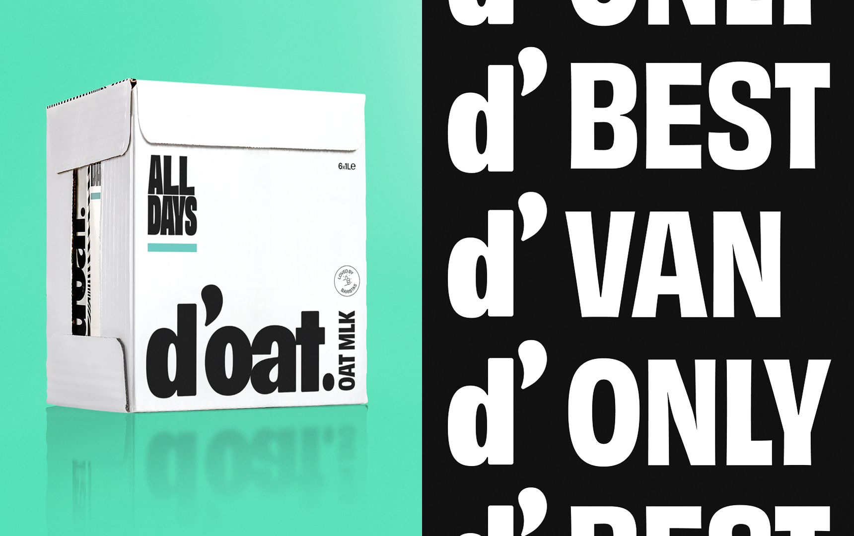
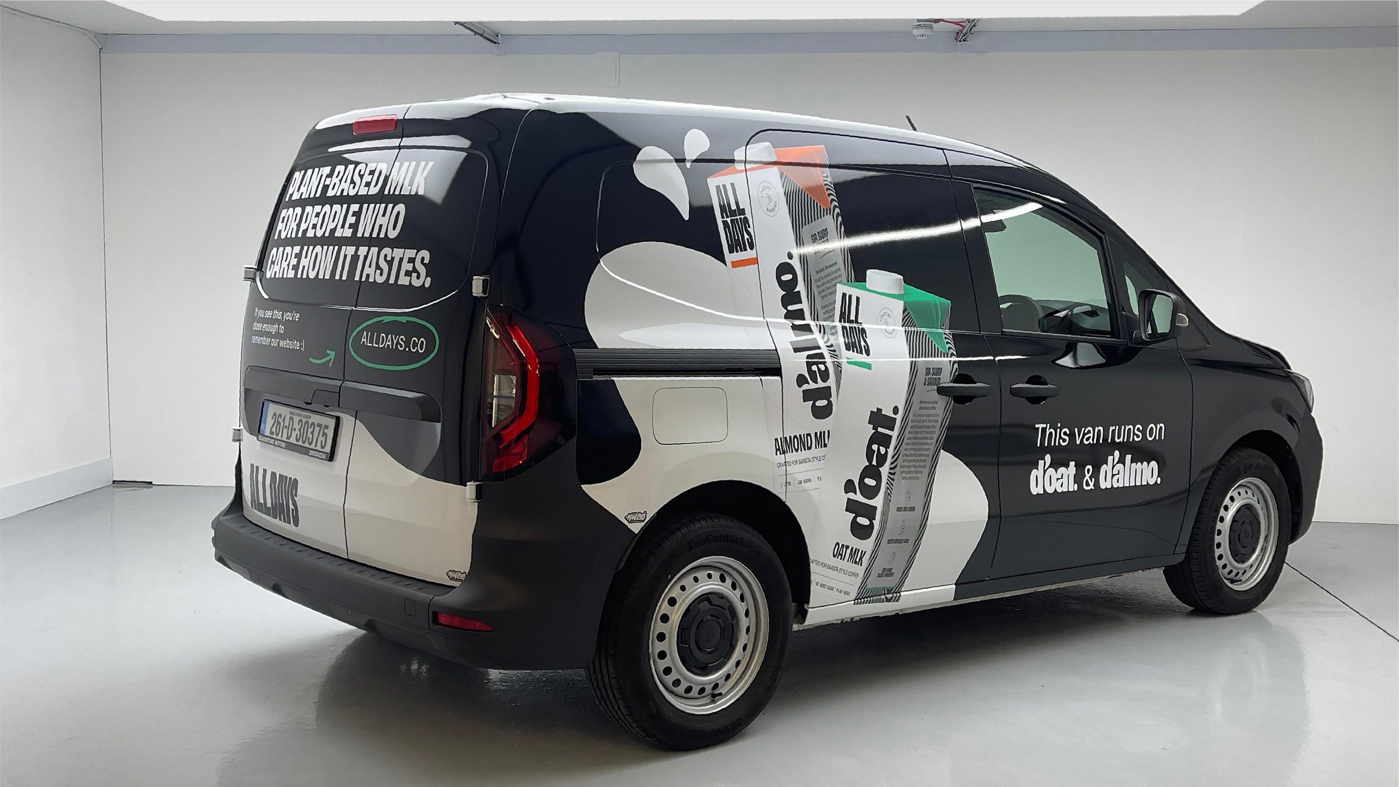
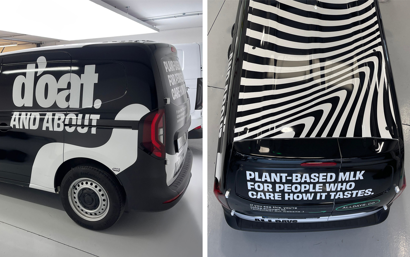
That thinking extended into the wider messaging system too, using the shorthand “d’” as a playful, flexible branding device across merchandise, vans, campaigns and social – from d’van to d’best to d’only. Small details that give the brand a recognisable voice, a sense of place and deliver that warm Dublin charm.

We defined five guiding principles to keep the brand honest and focused:

1. Taste first

2. Built by makers

3. Craft over noise

4. Earned attitude

5. Set the standard

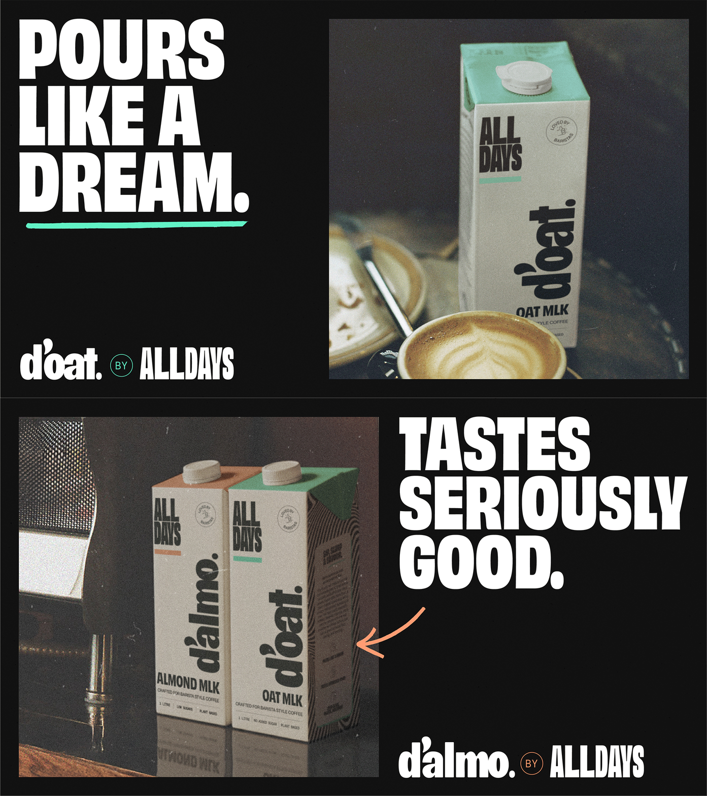
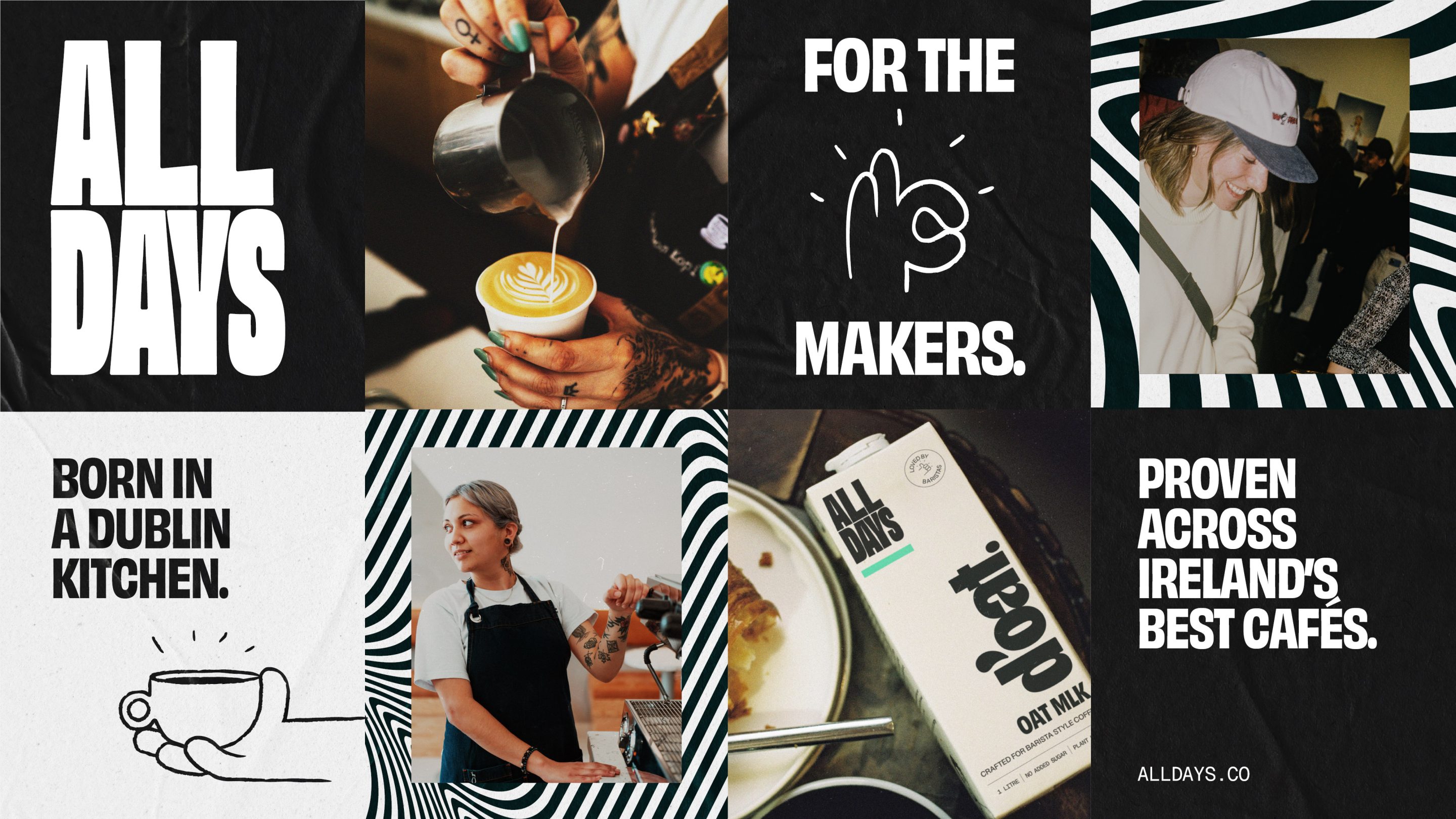
Visually, we stripped everything back to what matters: A bold, typographic system. Black and white at its core. Product-led accents. Structured, but never rigid.
And verbally, we kept it close to the source. Clear. Dry. Confident. No performance. No filler.

The result is a brand that doesn’t try to win the ‘plant-based’ category conversation. It changes the tone of it.

The inspiration

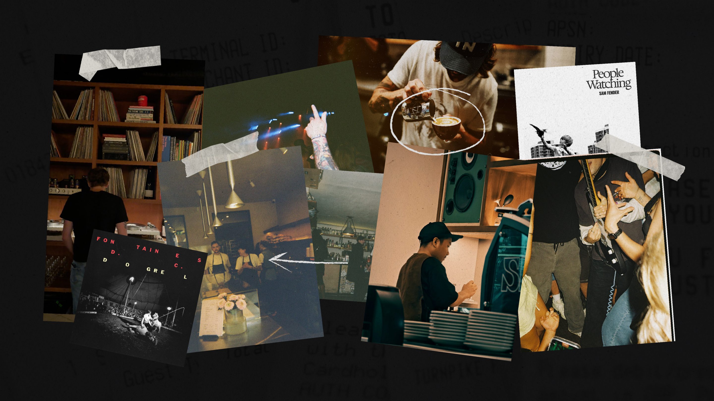
We didn’t look to the plant-based aisle for cues. We looked to culture.

To the pace and pressure of a working café. To the quiet confidence of independent makers who let the work speak. To brands built on obsession, not optics.

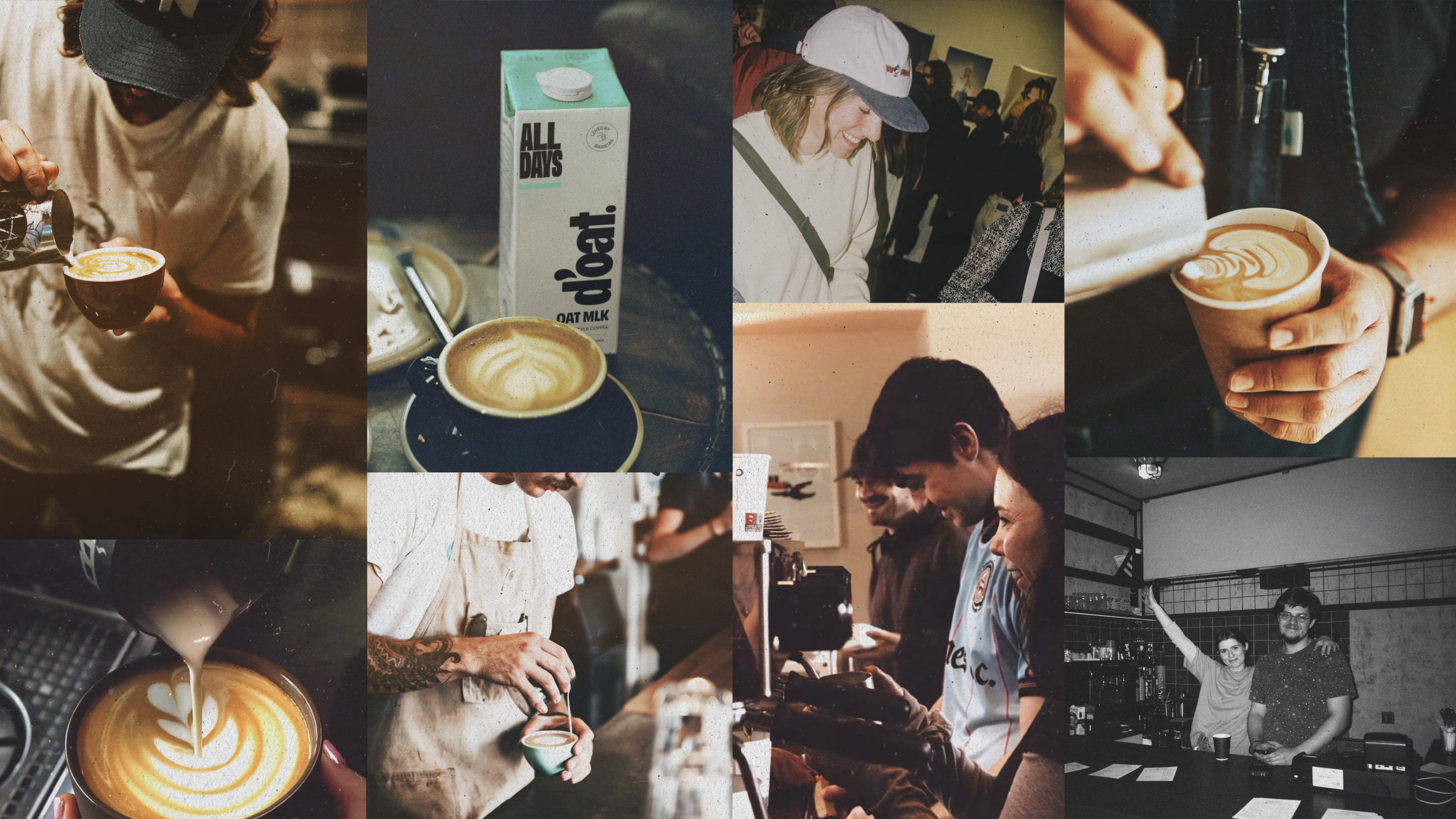
There’s an editorial sharpness in the typography. A documentary honesty in the imagery. And a certain attitude drawn from music culture – think the stripped-back confidence of Sam Fender, the bold, uncompromising presence of Fontaines D.C., or the anthemic clarity of The Killers.

With strong type and tight spacing, nothing’s wasted. Space is used like silence in a track…intentional, controlled, confident.

It’s closer to a gig poster than a wellness brand. And far closer to the realness of the kitchen than ‘a brand campaign’.

Because the most credible brands in this space don’t perform. They just deliver, over and over again. As d’oat and d’almo already do.

What we did

A full brand reset, built to scale across every touchpoint:

  • Facilitated brand workshops to define ambition, positioning and principles
  • Developed the ALLDAYS masterbrand name and strategy
  • Created a scalable brand architecture (ALLDAYS → d’oat. / d’almo.)
  • Defined tone of voice and messaging frameworks
  • Designed a complete visual identity system
  • Rolled out packaging across cartons and multi-pack formats

And beyond the shelf:

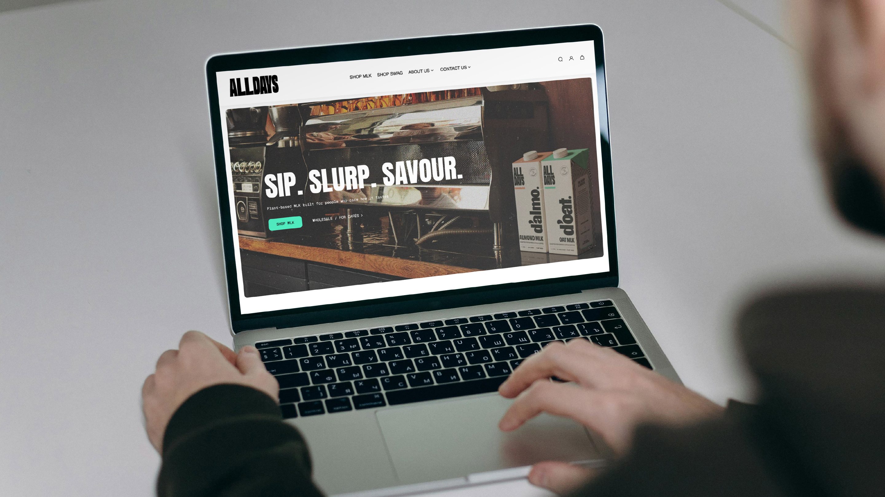
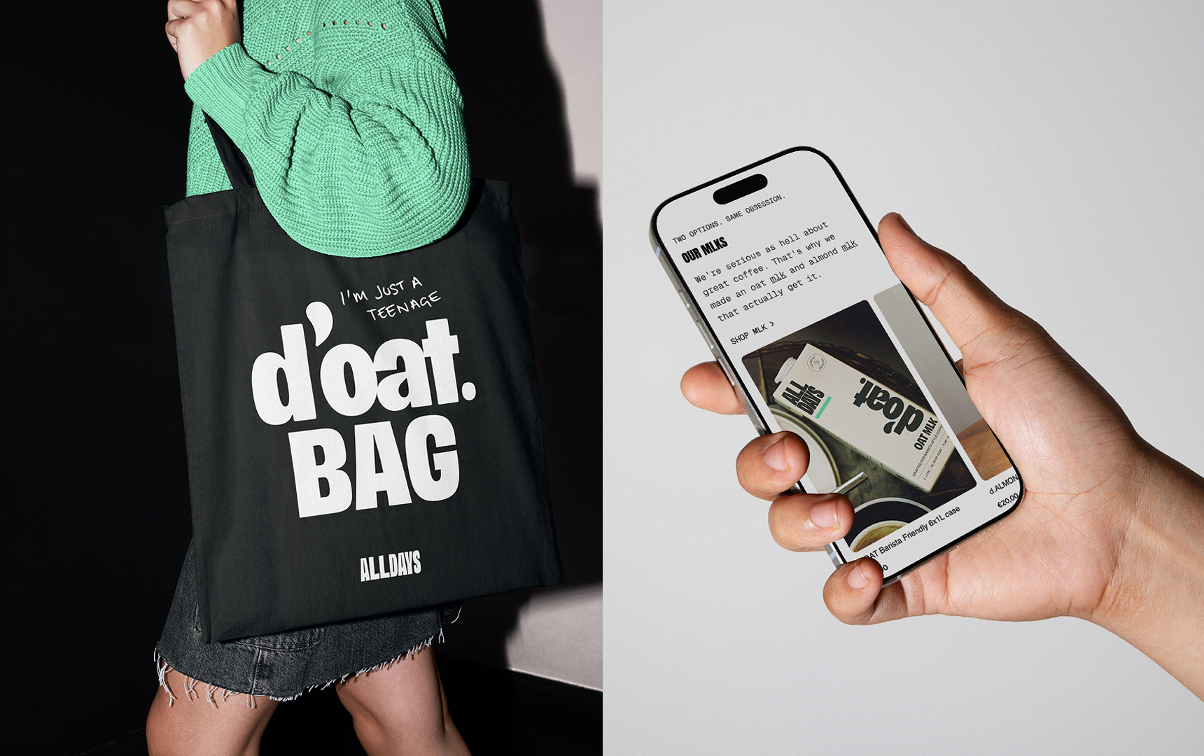
  • Designed and updated their eCommerce experience, bringing the brand’s clarity and confidence into a digital environment
  • Created a flexible IA and content structure that balances bold expression with usability and conversion
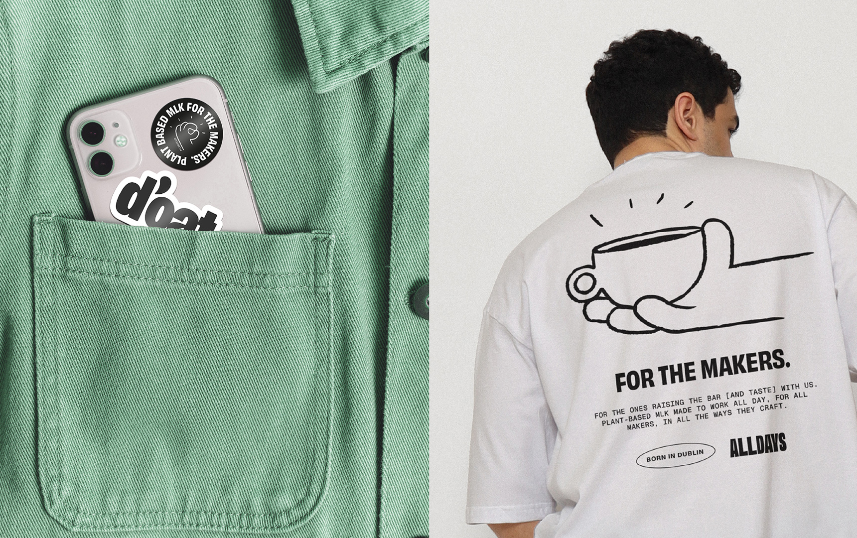
  • Developed a suite of merchandise – from sweatshirts and oversized tees to totes and stickers; turning the brand into something people can wear, carry and share.
  • Designed bespoke van livery for when they’re d’oat and about on deliveries 🙂

Every element working together. From café counter to checkout to culture.

The shift was immediate, and built to last.

  • A clear, confident masterbrand with room to grow
  • A scalable system ready for new products and markets
  • Stronger shelf presence through distinctive design
  • A digital experience that feels as considered as the product
  • Merchandise that extends the brand into culture
  • A tone of voice that feels real, not rehearsed

Most importantly, the brand and its ambition now matches the product.

And in a crowded, often over-claimed category, ALLDAYS doesn’t try to be everything. It just raises the bar, sets the new standard, and backs it up, all day.

Testimonial

“I initially contacted Ebow with the idea to begin retail marketing. We had previously done most of the work ourselves and were new to working with an agency. While I knew our branding wasn’t perfect, I thought we just needed a minor refresh.

After a few meetings, the Ebow team was bold enough to suggest a complete overhaul from the ground up including a name change. Crazy scary as a small business taking on big players, in a crowded category, that we had somehow managed to find a place in. But they recognised that any investment in marketing would have been wasted without getting the branding right first. While other agencies might have simply taken our money to deliver a generic campaign, Ebow provided a vision that resonated with who we are and who we knew we could be.

The process was so, so fun and I was blown away by every presentation. Nikki was a real legend and embraced all our mad ideas and references – distilling them into a singular, impactful vision with the most insanely talented design team at her disposal. We have so much more life, vibrancy and fun in what we do as a result.

They have taken us to another level: from only OK to HOLY F*CKEN SH*T. WOW.

The response at the Dublin Coffee Festival where we first showed off our new identity confirmed we made the right choice… even customers who were long-term attached to our old branding were incredibly impressed and could see we had made a big step up.

We can’t wait to continue growing our relationship with the team and seeing where this project takes us.”

Ste O’Loughlin
– Founder of ALLDAYS

You might also like

HSE

Driving national behaviour change at scale for Ireland’s health service

TRB Chemedica

Unifying a global pharmaceutical presence into a scalable ecosystem

RBK

A people-first digital experience for a leading Irish accountancy firm

HSE

Driving national behaviour change at scale for Ireland’s health service

TRB Chemedica

Unifying a global pharmaceutical presence into a scalable ecosystem

RBK

A people-first digital experience for a leading Irish accountancy firm

Get in touch